


It’s February and that means purple! At least to me, since I have a February birthday and have big love for Amethyst, February’s birthstone. Another fun purple event this month is a jewelry design challenge in SRAJD, Self-Representing Artists in Jewelry Design, a membership group of designers and makers. “Something Purple” was the theme and I’m thrilled to share my entry with you.
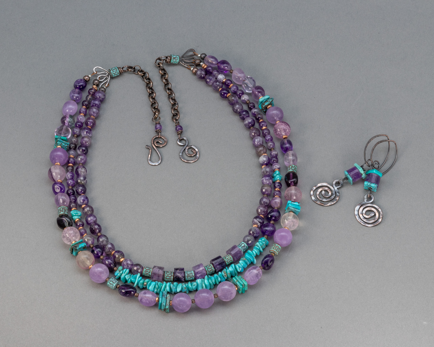
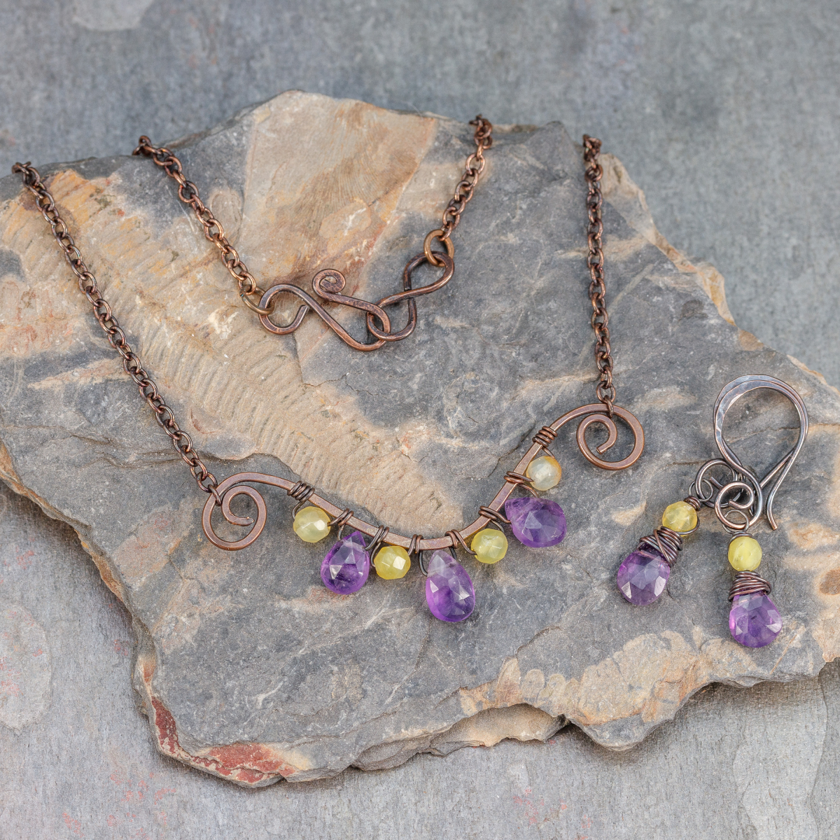
Design challenge piece: Three-strand necklace and earrings jewelry set by yours truly/Pebbles At My Feet. The purple theme is fulfilled with amethyst and fluorite gemstones in violet and red violet colors and multiple tints and tones of purple. I’ve accented the purple stones with genuine turquoise and Greek ceramic beads that have a greenish patina. Wire work clasp and spiral ornament on the earrings are handcrafted in copper.
In addition to my new piece for the challenge, I’ve been featuring many of my amethyst creations in my Instagram and Facebook pages this month. I thought it would be interesting to talk about purple color schemes that I find pleasing and see what you like, too.
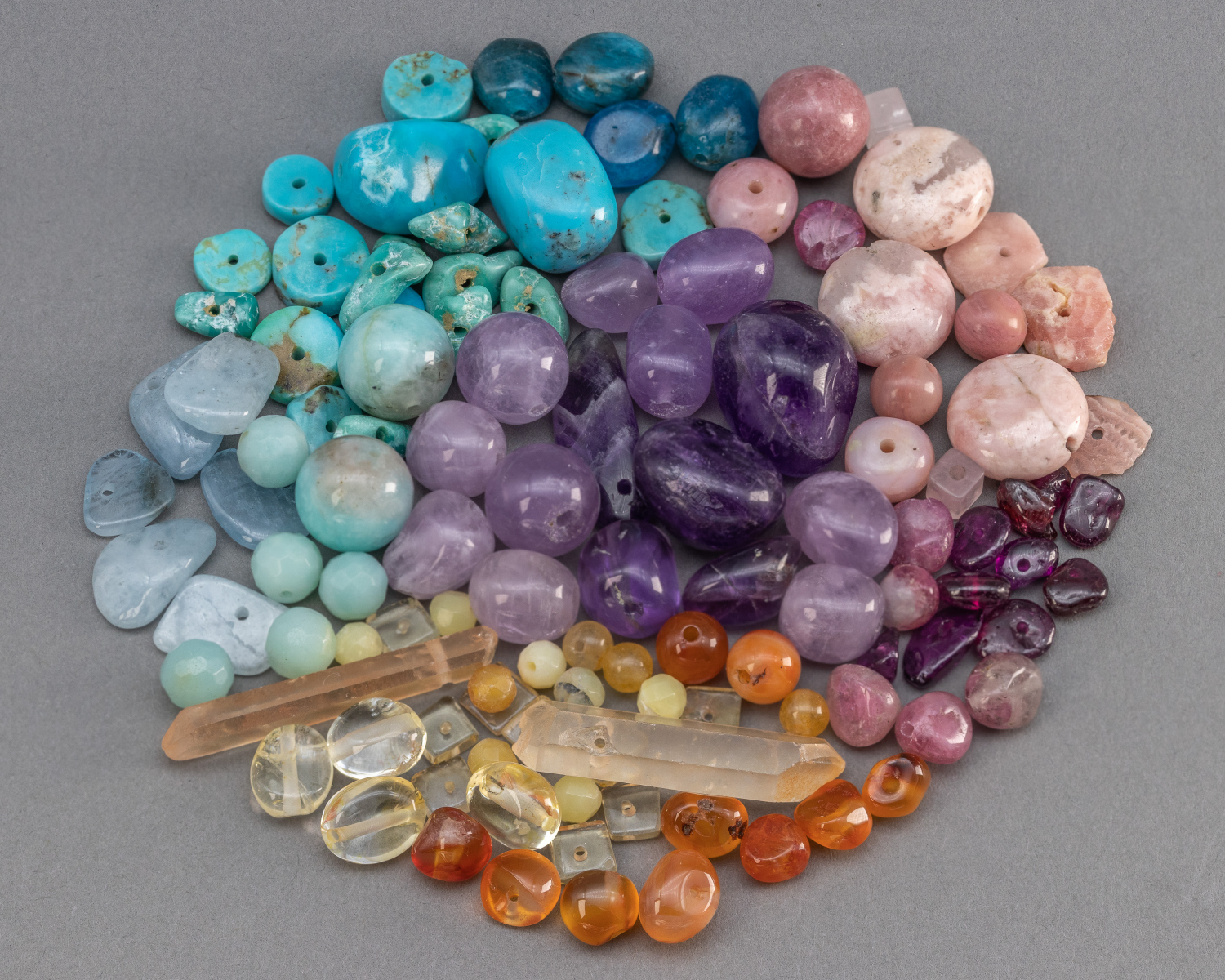
When I design a piece of jewelry, the colors I choose are usually inspired in three ways: 1) an intuitive "like" of a particular color combination, 2) a bit of color theory using a focal color and finding harmonious combinations using the color wheel, and 3) the colors of Nature in the landscape around me and places I've been (including seasonal changes). For my SRAJD design challenge piece I was guided mostly by factor 1. I love turquoise and/or teal with purple. I’ve worked with turquoise and amethyst and apatite so I know the color scheme “works”. Sometimes my intuitive feel for color needs a little grounding in reality. In a practical sense, my designs are constrained by what stones I have on hand - the paints in my artist's pallete. Here, I’ve put amethyst in the center of this pile of “pebbles” and explored what other stones might go with it. A lot of my jewelry begins this way. Do you see a combination that you like in this pile?
"Go with your gut" designing with amethyst.
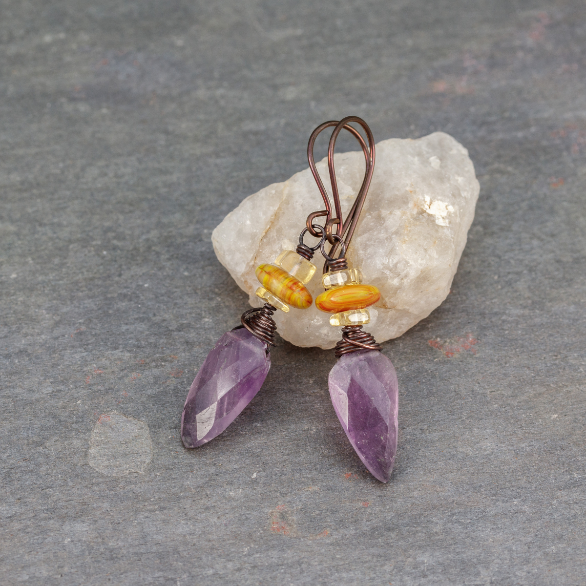
These amethyst earrings started with the pretty amethyst briolettes. I loved the color (a little on the red side of violet, with gradation of tone within them). The rest of the design was influenced by factor 2, color theory. The stones in the gemstone cluster are colors are adjacent to each other along the color wheel. Violet, blue-violet/blue, and blue-green. For those who like to know, using three or four colors next to each other on the color wheel is an analogous color scheme. Gemstones are never "pure color" like the color wheel represents. The translucent or opaque quality of the stone factors into how we perceive the color, as does the level of polish and even the shape. But still, there is design guidance in color theory.
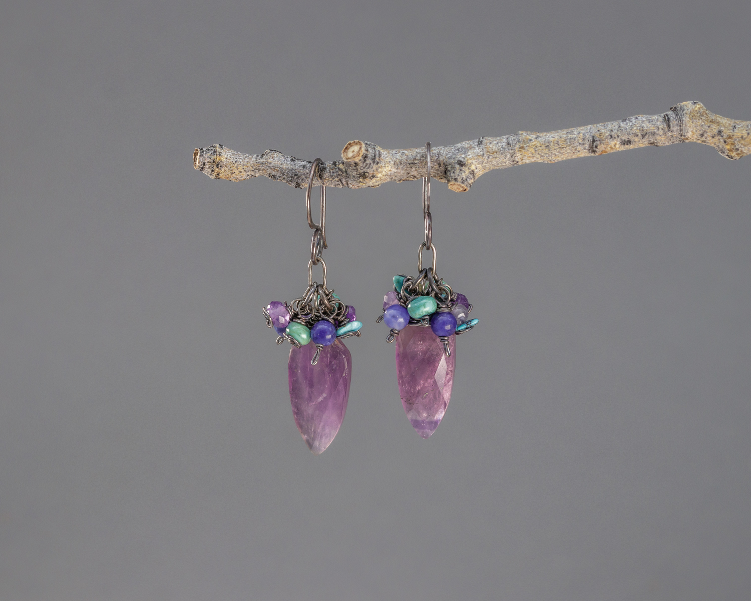
Amethyst gemstone fringe earrings with turquoise, turquoise magnesite, and sodalite. Designed with the aid of the color wheel, the gemstones represent adjacent colors.
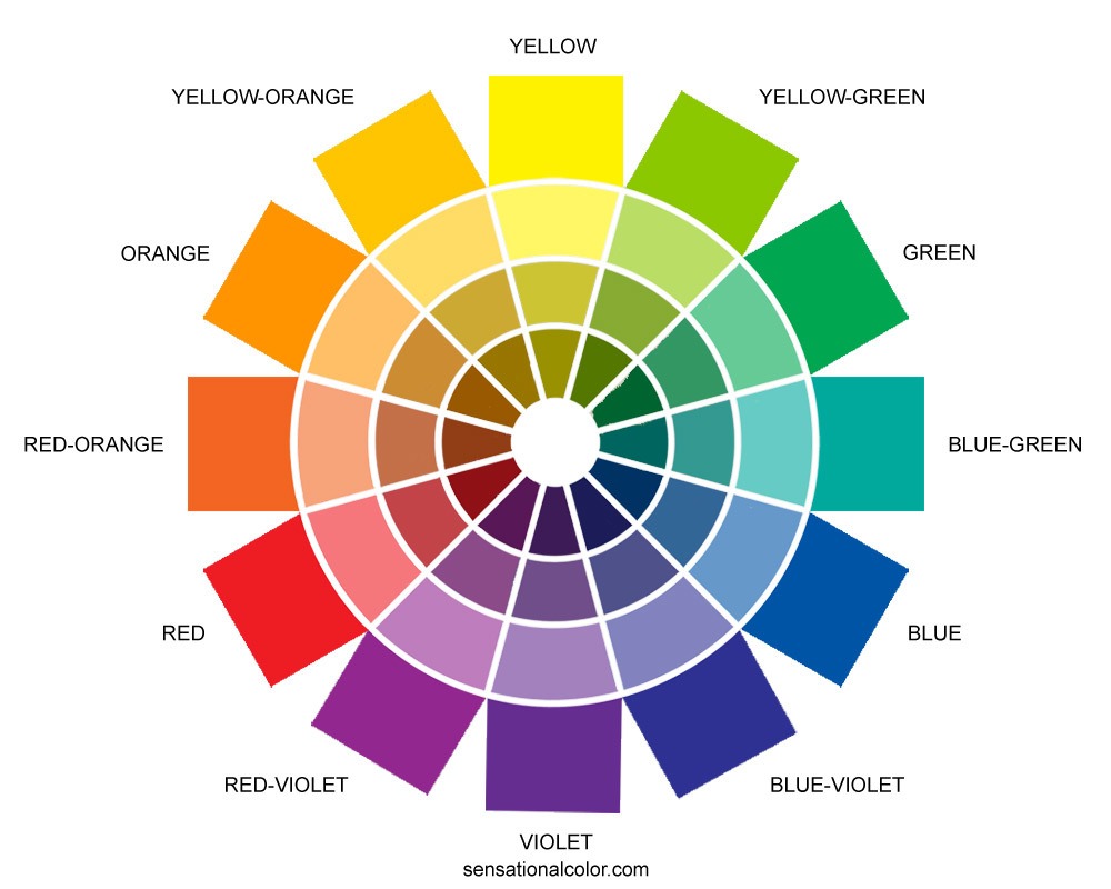
A sample color wheel taken from https://www.sensationalcolor.com/color-wheel/ a great site to explore color theory in interior design, website and branding, and more.
What other colors go well with February’s lovely purple gemstone? If you only want to use two colors go for the opposite on the color wheel and try a complementary color scheme.
Complementary color scheme left: Amethyst with yellow opal necklace, rght: earrings with amethyst with citrine gemstone and Czech glass.
Knowing your way around the color wheel is a great tool for the jewelry designer. It can serve to help “unblock” and get one started designing around a featured color, or in my case, gemstone. Put purple with yellow-orange and yellow-green and you have a split complementary palette or go monochromatic and stay with one color, exploring lighter tints and darker tones and shades. Natural stones have such variation in color tone that this is often a very pleasing way to design. I like it because putting the variations together in one piece of jewelry provides a better sense and appreciation of any one stone.
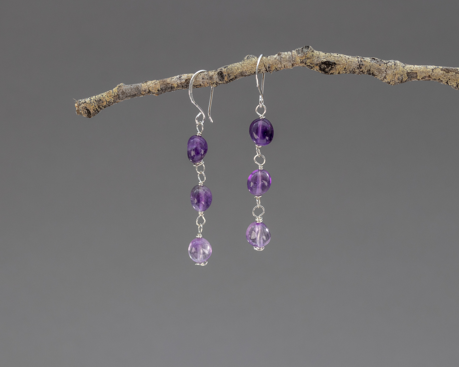
Amethyst pebble earrings with pebbles arranged in ombre set of purple tones. The sterling silver setting keeps the color hue true.
Honestly, most of my color inspiration in my jewelry designs comes from factor 3, Nature. I love the colors Nature puts together: fields of wildflowers, crazy colorful sunsets, riotous fall foliage, red rock canyons and blue skies. Of course, I’m already working with natural stones (products of Nature themselves) and it’s true that sometimes it is the stone itself that is inspiration and end product in my work. But let’s take a look at some of what Nature does with purple. These might just appear in a jewelry piece next time I design with amethyst.
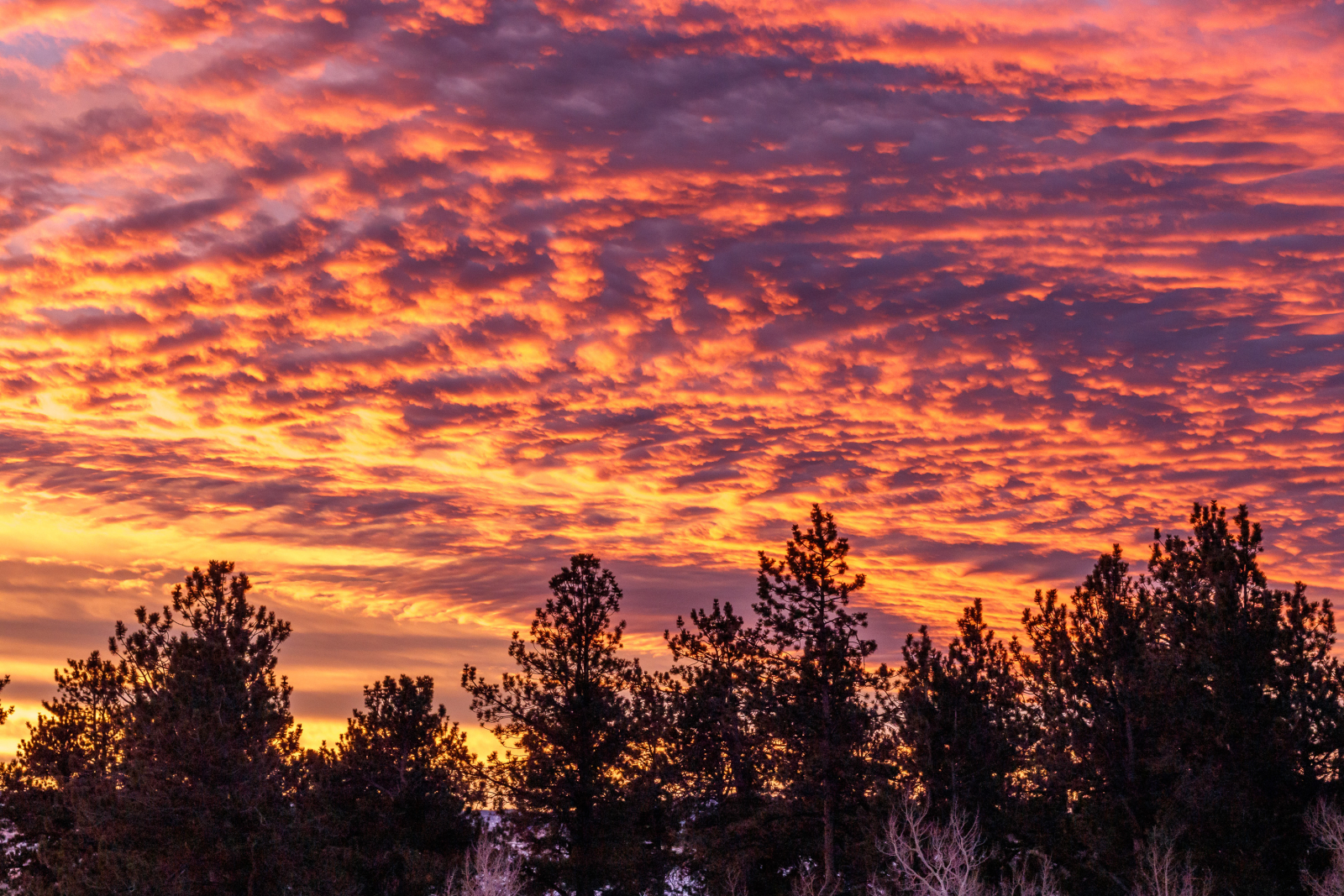
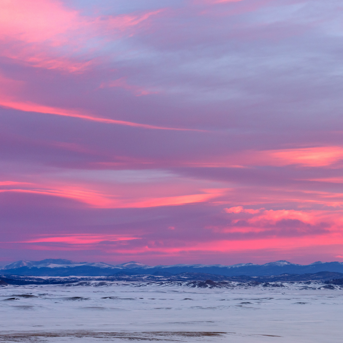
Nature is certainly not shy about using color at sunrise! (or sunset)
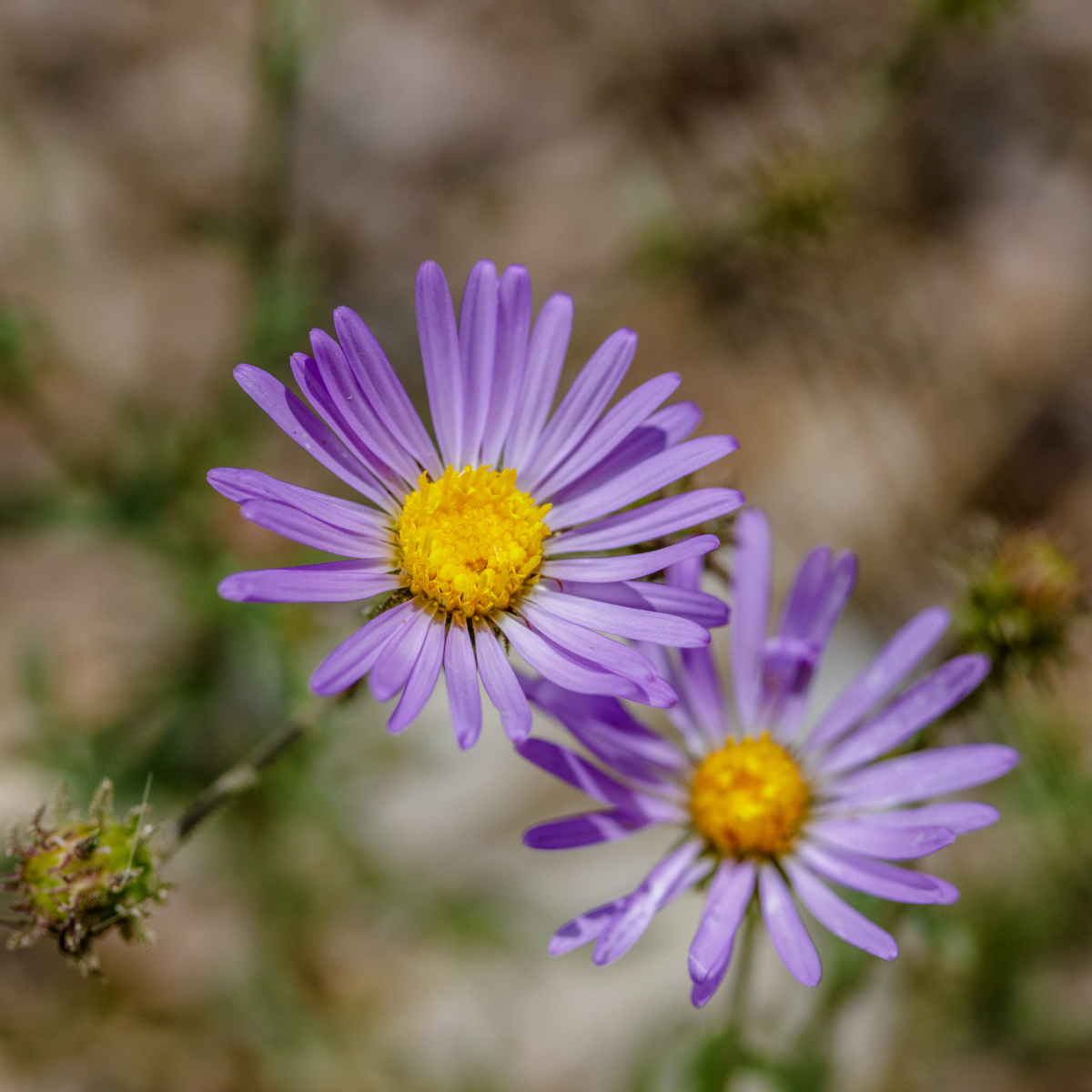
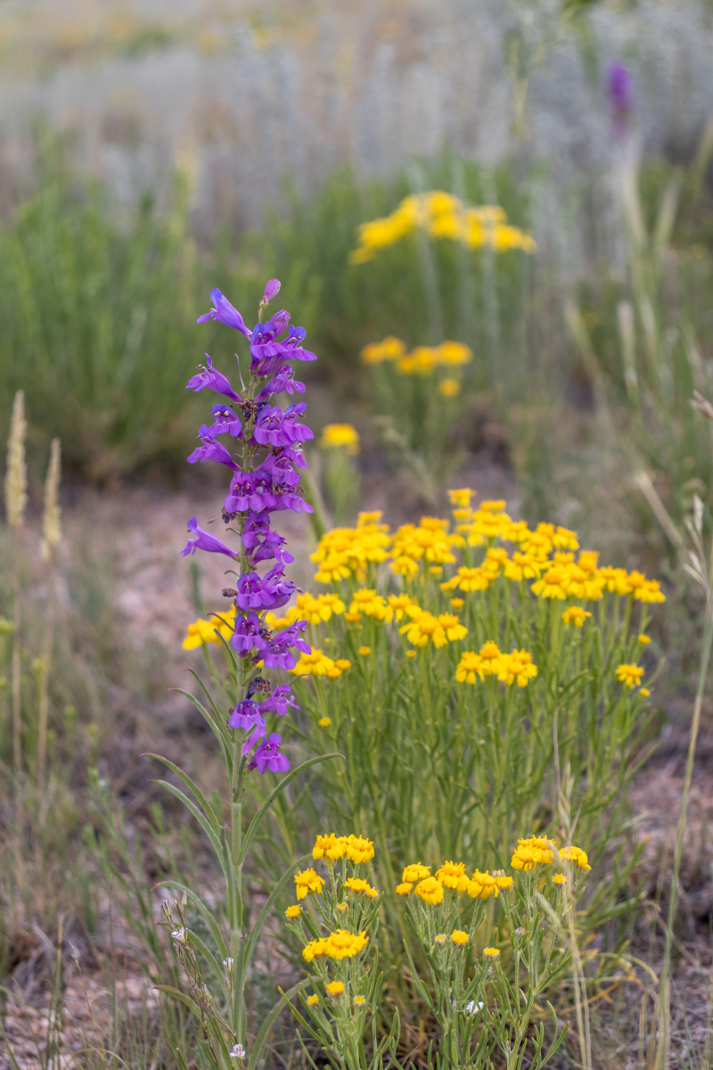
Whether it’s a field of wildflowers or a single bloom, the complementary colors of yellow and purple are eye-catching and harmonious.
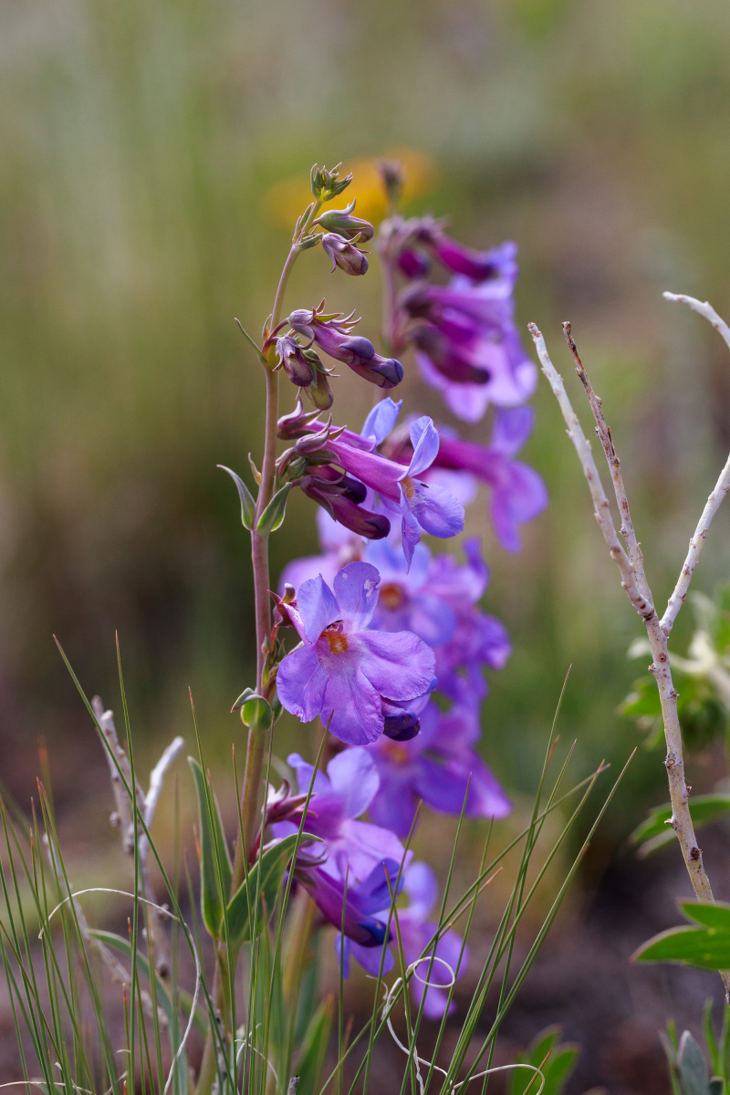
These penstemon wildflowers show blue, violet, and red violet in their delicate petals and a little spot of yellow at their centers.
I hope you enjoyed coming along with me as I rambled on about designing with purple amethyst. Do you have a favorite color scheme centering around violet or red violet? Let me know with a comment.
Thank you for reading.
Pamela
Pebbles At My Feet Natural Stone Adornments
Interact with my social media pages